Friday 24 February 2017

Introduction

Introduction

In this blog, I will be keeping a diary of my progress for my AS Media studies coursework. My main task is to make a 4 page music magazine and my preliminary task is to create a cover for a school magazine, the magazine can contain anything as long as it is do with school and targets the audience I want to target.

My school magazine is a tool for students to get aware of what is happening in school e.g events and clubs so, they can get involved in school life. I'm targeting students from The Heathland school; mainly the lower school as they are more likely to be interested in trips and clubs. I will create a flat plan to arrange my layout ideas and mind map to show my ideas of colour schemes, masthead, fonts and feature stories.

Furthermore for my main task, I will to be thinking about the conventions of a music magazine in order to get a good grade and create a perfect music magazine. I will take my own photos to put into each page linked to my featured stories. Examples of music magazine are: Vibe, Classic Rock, Billboard and TimeOut.


Monday 20 February 2017

Evaluation

Written Evaluation

In what ways does your media product use, develop or challenge forms and conventions of real media products?

A convention is what is associated to make a product, for the rock genre in terms of its content, form and style. For example rock magazines usually follow a dark colour scheme. As such, when we see a model holding an electric guitar on a front cover, we apply our previous knowledge of similar magazines and make assumptions about what genre the magazine is. My media product follows the conventions of real media products in many ways. 

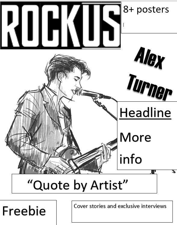
The masthead at the top left corner is an example of a convention in my magazine. The name of the magazine is unique and is a smart play on words. "ROCKUS" could be read as "ruckus" which means a lot of noise and commotion or as "Rock Us" associated with a famously known song we will rock you by Queen. The name therefore fits into the rock genre and the stereotype that rock music is very noisy, with an association to famous rock bands.

The tag line used is placed on the top and bottom of the magazine, it includes the list of all the featuring artists. There is also a puff that brings attention to the cover line that gives exclusive content. The puff and tag line are also conventions of a music magazine cover. The colour scheme I have used is black, red and white which compliment each other and are conventional as are commonly seen in rock magazines. 

My anchor follows conventions as she is holding a guitar. She is looking directly at the audience to create an intense atmosphere and it makes the reader feel more immersed in the magazine as the anchor model is directly addressing the reader with her posture and pose. Furthermore, the model is the biggest object on the cover and right underneath her is the main cover line in the form of a quotation, the biggest font after the masthead, meaning that she is the most important feature to focus on.

This follows the conventions of a magazine cover when looking at font size and how the main cover line is presented on the cover. My magazine similar to many editions of Kerrang! I have analysed previously for inspiration through analysing the colour scheme, layout and content used. It has a C layout which is often used by Kerrang. Kerrang covers a lot of articles about new music coming out and interviews with artists just like the model shown on my magazine cover. 

The cover of my magazine is successful as the images fit the content and target my audience, immediately attracting the audience to the masthead, main story and anchor model. The design of the magazine attracts a mainstream audience. Other conventions I follow are barcodes, price, date and issue number. Those are necessary for a magazine to be published as they provide general needed information of the product and a barcode is important for the consumer to buy the product.

The contents page has great purpose and is very important as it provides the reader with easy access to find out what the articles are briefly about. My contents page was hugely inspired by one of the contents pages from an older edition of Kerrang! Magazine that I have analysed previously. This is seen through the layout and the way content is organized. 

There are columns at the bottom half of the page and a main picture at the top half of the page. The content is laid out like a list and divided into categories. Each article is attached with a page number right next to it: to guide the reader to a page relevant to their interest. The article also has a brief description for the reader to decide what to read first depending on their interest. The way the content is organized is common in rock magazines like Kerrang and therefore "ROCKUS" magazine is strongly conventional.

The band names are in bold red font for the reader to select their favourite artist. An editors comment is placed in the first column signed by the editor themselves, this is not a necessary convention but it is commonly used, particularly in rock magazines. The contents page is successful as it is giving quick and easy access for the reader to find articles and it gives the magazine a sense of order. 

The name of the magazine is at the top right corner and it includes other small images to give a sneak peek of the article to the reader, which are conventions of a magazine. At the top left hand side of the page, is titled "contents" this is also a convention of Kerrangs! Content page to make it obvious that is a contents page. The main image is at the top,it doesn't have a caption but is just attached with a number and artist name, this challenges conventions as usually there would be a caption. Other conventions that I used are issue number conventionally placed right under the title.

The double spread feature page has similarities to music magazines as it’s a personal interview with the artist. The conventions of a bold name of the name artist and brief description of the article introducing the reader who are unaware to the artist. In some ways it challenges conventions as the main image isn't the biggest object but it’s still evident that both it is linked to the artist that is being interviewed. The article takes most of the two pages and is divides into three columns focusing on the artist that is featured. Every time the interviewer and artist speak it is very clear to the reader by having their initials written in bold before they speak. The quote used is bold and big .Furthermore, the name same one used in the cove page showing a clear link to the reader.

Throughout my magazine the same colour scheme is used and the content covers popular artists and bands which is very common; The interview on the double page is very inspirational discussing artists future plans and how they cope with their busy lives .The colour are very bright and fun to encourage readers interest the intuitional logo is on each page of the magazine. The magazine is dominated by images as images speak louder than words and are the things a reader looks at .This together created a house style.

Who would be the audience for your media product?

Most of my audience would be students or casual workers, young people aged 16 -24. This means they would be at the lowest income in the economy.

How does your media product represent particular social groups?

My media product represents young people aged 16 -24 that have an interest in rock and this made through the content of my media product and the rock artists that I have created. The artists are represented as very fun loud, inspirational, talented, fresh and laid back. This is achieved through their body language and costumes. My audience is very influential and would look up to those artists and what they have achieved for example in the interview of Selkies she discusses a charity project which spreads a positive message to the audience and also discusses her will to help other which also inspires artists to do the same. On the front cover and feature page the artist "selkies" is represented as Fun, talented, hard working through posture, face expression and props. It’s a medium shot of the main model holding a guitar, she's holding the holding the guitar as if she's playing and is slightly leaning back, and this illustrates her laid back aura and many of her talents. Also her facial expression is joyful and cheery reflecting her positive attitude to life.

 How did you attract your audience?

The language is very simple and easy to understand which applies to my target audience as they are young adults they wouldn't want to read something difficult and challenging but something they could read at easy. The use of a lot of images also helps with attracting the young adults as they would want to look at images of their favourite artist, especially in this age of modern technology. By promoting free posters it would attract the audience as it doesn't cost them anything and encourage them to buy the magazine s they feel like they are getting a good deal as in return they can get posters of their favourite artist to put up on their wall. In addition the price of the magazine is 1.99 which affordable for my audience who would not spend much on luxuries and is most suitable as I found out through my research that my target audience prefers this price the most.


What kind of media institution might distribute your media product and why?

There are many methods of distributions of magazines and they either traditional which is hard copies or digital like apps and websites. Traditional copies distributed through publishers which are the institutions that produce the magazine. Now digital copies are becoming more popular as it became a norm to own a smart phone, where the magazine can be viewed on the internet. The hard copies are distributed to the consumers by retailers sold in supermarkets and newsagents. However, because of the rapid growth of technology like smart phones as a result of web 2.0 and convergence digital distribution has been becoming more widespread. Through convergence my media product can be presented on many platform like radio, online and social networks for example Kerrang! Is begun as a magazine but later on it had its own radio station as well its own TV programme and website. This would be useful in order to gain a wider audience when reaching more media institutions. The readers can also subscribe to the magazine to get monthly or weekly posts to their home or inbox with a discounted price. This is great deal for the audience and ensures regular readers by giving them a discount.

The magazine can also have a electronic version .They are similar to magazine website for example they have pages you can turn, page numbers and adverts. They have their own special features such as video clips and links that will send readers to other sources. Many magazines have their own smart applications where the content of the hard copies of a magazine can be accessed. An example is the NME magazine app. Sometimes magazine have a QR code that could be scanned via phone.

I think BAUER media group would be suitable as an institution that will distribute my magazine. This is because they are one of the top distributors of magazines in the UK and own a lot of rock magazines. Two of the most popular music magazines published by Bauer are "Q" and "Kerrang!" as well as "Mojo". Which is the type of music I have created in my media product and experience with my target audience which are young adults. BAUER media also uses digital media and is presented in all types of platforms. Kerrang! Radio has With 920,000 listeners a week with a total of 33,024 circulation of .Therefore, I think it would be the most suitable as a distributor of my product.

Looking back at your preliminary task, what do you feel you have learnt in the progression from it to the full product?

Through the process of constructing this media product I learned how to create a magazine on Adobe Photoshop. I have improved my Photoshop skills. Now I know how to add effects like drop shadow to images, edit text, manipulate and edit images using tools such as the magic wand. I also gained experience in photography during the photo-shoots. It taught me about the importance of lighting and camera angles in a shot and how it's important to plan the photo shoot beforehand to ensure you're completely ready and have all the props you need. I learnt what works best for my media product by experimenting the layout and colours. Moreover, I have never blogged before so, using blogger to publish my work gave me good experience. Gradually through the process I learned more about how to attract an audience in comparison to my preliminary task the audience is targeted better.

What have you learnt about technologies from the process of constructing this product?
Throughout the project I learnt what it takes to create a media product. Being the researcher by looking at other magazines and figuring out the conventions of magazines that made them successful.During the photo-shoot I took the role of the photographer as well as the director where I ensure that I got the images I desired for my magazines. I had to plan the photo-shoot and make sure all the props where ready to be used .Moreover, Taking the role of the layout the designer Created flat plans as guides for my magazines, this gave me a variety of ideas for the layout of my magazine. I also took the job of the editor as the features writer and features editor where I ensured each page followed necessary conventions and the Photoshop was smooth. Lastly being the manager editor, I had to make certain everything was done in time. By taking all of those jobs on board, I learnt not only about the creative process of making an idea alive but also the research behind it and the editing that constructs a successful product.


bg7 m6bgk6 dhy6bk fd

Monday 30 January 2017

Media Photoshoot photos

The following photos are pictures I took for my magazine. Some of those photos were used for my contents , cover and feature page.


Friday 27 January 2017

Photoshoot Timetable

This was the time table I made that planned my to photoshoots my photos for my media magazine. This was created provide me (the photographer/art director) information on what people are needed for each shoot and equipment as well the time and place of the shoot.

Monday 23 January 2017

Flatplans

I have created two flat plans for the cover page , feature page and contents page.This will give me a variety of ideas for my media product


My double page spread will be have the main mode on the side of the page with other images on the other side while the main text will be  spreading across the pages.my model in the left side and the text to the right.  This is because people read from left to right and therefore the model will catch the readers attentions and show them what the article will be about..  The title of the double page will spread across the pages under the models head.
The text will be laid out into three columns .


Here are the plans for my front page.I would like my cover model to be centered in the middle with name of an artist and their quote besides the model.The masthead positioned on the right top of the page being the biggest text on the page.The barcode and price in small text places on top of the page next to the logo.There will small images with text explaining the content briefly surrounding the main image. Im also planning to include a freebie of free posters .Both plans follow the conventions of a magazine cover however i decide to base my magazine on the flat-plan on the left as i prefer the c-layout of the magazine.

Those are the flat plans for my contents page.The one on the left was inspired by classic rock magazine content pages.On the left side there page numbers along with content of each page .The masthead logo is on the top right.The main image is the biggest.The content is split into categories to make to it organised and help the reader to find what they wants.On the other side we have a flat plan inspired by kerrang! its laid out differently to the other flat plan as everything is laid horizontally on the page there is also images.The one on the right focuses more on having images.Both follow the guides to a successful content page as they are well organised and follow conventions.I decided to follow the flat plan on the right as i think i having a lot of images to each is more interesting than lots of text and the i really the lay out.

Friday 20 January 2017

Questionnaire results

Those are the results that i have collected from a group of 20 people ,represented in the form of a pie chart.Each chart will show you the results to each of my questions.


This chart shows the age groups whose responses were collected.Majority of the people were 13-18 and the second biggest group was 15-21.My target group focuses on young adults therefore, those results will be useful in seeing what my target group wants there to be in my planned project of a magazine thus, helping me to make successful.


In this questions i asked the participants to tick the box with the colour they prefer.More than half of them said: red,black,white , this is no surprise as we associate those colours with the rock genre.The second most popular was : navy,black blue this slightly unconventional to the genre but can be fitted to the rock as it still is a quite dark colour.I will therefore definitely include the classic colours but also include other dark colour like navy blue.


The chart below shows us what the people asked said about the content that they would most likely want to see in my rock magazine.Eight of them said interviews therefore seeing the popularity of this type of content i will make the main article an interview with a rock a rock artist.Five said news should be in the in the product so, in my magazine i will ensure there is information of new artists and progress of current artists included. Others said reviews and feature artists as well as advice but that was the popular.I will also include those to appeal to everyone.


This chart just show the percentage of the males and females of the group i asked.90% were females therefore i need to keep that in mind that those questions were mostly answered by female so i will be appealing to that group.

I gave the participants a number of mastheads to choose from .Most chose the first masthead , this masthead was simple and bold unlike the others that looked more artistic.The second one had this effect of liquid pouring onto it resembling blood 6 people people chose this masthead perhaps because they agreed that it would fit the rock genre as it is gory.The thirst masthead was the least popular,it has an urban style.I will use the first masthead as it was popular for its simplicity.
This question concerned itself about how often would the magazine be published .9/20 said weekly  therefore i will make the magazine to be published weekly.
I also asked the people to state their preference on types of rock music.The results were quite evenly spread out except classic which only got 2/10 perhaps because classic rock is outdated and old nto appealing to the target audience.The others scores 6/20 each therefore i will include different types of artists that perform either electronic,pop or indie music.
Finally for the last question i asked if they would want a free gift in their magazine.All said yes therfore i will include a freebie in the magazine. 
These are the results I achieved through the questionnaire. I found out that pop rock was popular in my research. i will try to focus to make my magazine look like a pop rock magazine by looking at other Delete repeated word.I also found out that the age group is young teenagers, this means the prices of the magazine would have to be low to be affordable to my target audience. Moreover, I got an grasp of what my audience wants my content of the magazine to cover.Most people preferred interviews but the rest of choices were pretty evenly distributed.Therefore I will try to cover all content mentioned but focus on interviews to specifically target my audience. I discovered that people felt that the most suitable colour scheme for my rock magazine was red, black and white.Therefor I will try to adapt it to my houstyle. The  people I questionnaired said they wanted the first font to be the masthead so, I will use this font as the masthead of my rock magazine. Through this questionnaire i found what my audience would want the magazine to look like and its content as well the prices of the magazines

Thursday 19 January 2017

Questionnaires

For the design of our magazine, we were asked to create a questionnaire to give out ,which would help us to find out more about our target audience for the media magazine product. This is the questionnaire I gave out randomly for people to fill out:


Development of main main task

Firstly i went for a more darker colour scheme for the cover but than thought that the cover would look more attractive with more neutral colours whilst still commiting to the black , red and white colour scheme.My masthead has a sort of metallic look but than i changed it to look more simple .The main image also changed , its the same model and prop however the way the anqor is position changed .When getting feedback from my teachers and peer they said some fonts and the barcode was unclear therefore i made the barcode bigger and made folder with added drop shadows.I also changed the positioning of the buttons .

My content page didnt take upon huge transformations however i added things such such as the editors signature and  rather  than adding one image to each of the titles at the top i had two.

Friday 13 January 2017

Textual Analysis:Design elements


1.Publication often use the rule of three to simplify things for the reader.This is when the design of the magazine has only three main colour's. When only those main colour's are used,the cover will look more neat and professional.When this rule of three is challenged, the cover would look unorganized and so it would loose its appeal.

In this example the three main colours work together with the main image.For instance the guitar has is silver and black so,the colour of the titles is also black and gold.
2.There are three main conventional layouts;z layout,c layout and T layout.The most popularly used is the C layout where,the masthead is at the top and the text goes round the main image either on the left or the right as you can see in this example:


It supports the narrative because the reader would read from the top to the bottom and end up at the corner of the page which, would make her/him flip the page and read on,

The T layout is when text is laid out on one of the side of the main image and has a masthead at the top.This is not commonly used but work really well with some main images,Lastly the Z layout is when there is a masthead at the top, text at the top and text in the middle across the main image.This is an example:


3A typefacerefers to an individual family member of a font.Typefaces are imprtant because because it guides the leader as to what is the most important in texts for example using a different typeface for the subtitle,makes the subtitle stand out.Avariation of different typefaces keeps the reader interested and using typefaces means that it will stay longer in the readers head.


Monday 9 January 2017

Case study


Kerrang is published by Hamburg based Bauer Media Group-media Company , which owns more than 600 magazines, over 400 digital products and 50 radio and TV stations all around the world.The media group has got multiple of different media brand, including heat and also a radio range of national radio brands such as KISS FM UK and Magic as well as regional radio brands in big cities in the UK.


Kerrang genrally specializes in rock music. Between the 1980's and early 1990's the magazine often organised thrash metal acts on the cover like the Motley Crue,slayer and Bon Jovi.However,it was often criticized for this as it repeatedly did this everytimes a new musical trend became very popular and known.


Kerrang! Magazine is published by Hamburg based Bauer media group which is kerrangs institution. They are in charge of distributing, marketing and producing different media products. Kerrang is a magazine but also provides an online subscription alternative, has a radio and its own TV channel. This means they can address to more possible consumers. Bauer only distribute only under the rock and pop culture, this means they are specialized in that area. Kerrang magazine is published weekly and their circulation is around 20,000.Each magazines sells for 2.20 pounds each in supermarkets such as ASDA in the UK.


The magazine mainly is targeted at males ages between 15 years old to 25 years old.This can be seen by the atmosphere and tone of the cover page, especially in the name of the magazine itself, which is shattered like broken glass.The very use of red across the cover signifys blood and anger.The whole look of the cover page is violent and very direct , the name sof the bands that are featured on the cover are also violent.Therefore, this would appeal to the sense of rebellion and violence in young adult males.An example of those names if foo fighters,rise agaisnt all, all of those examples are soemthing to do with resistance and the idea of violence.Those elements of the magazine must remain to attract this type of audience.

Monday 2 January 2017

Mood board for my main task

I have collected different types of images and symbols that emulate the genre of rock. In my mood boards I have pictures of famous  bands ,rock artists and band names .The reason is because they form the significance of the rock genre.I chose dark colours for my mood boards it was a common thing in rock and it reflected the conventions of rock magazines. The mood board i have helped me to get ideas for my final media product.

Sunday 1 January 2017

Labelling magazine covers


Magazine Cover
  • Typography is the typeface or font that is used in print text to make a specific text stand out for example like word "The Trend Issue" on the cover
  • Teasers are short phrases on the front cover which are used to tempt the reader to buy the publication.This is shown  "hollywoods most-wwanted newcomer"
  • "FASHION" This is a Masthead (tittle of a magazine)