I have created designs for each page of my magazine in the form of flat flatplans.This was useful to get a rough idea of what im going to do for each page , giving a start point.
I have created two flat plans for the cover page , feature page and contents page.This will give me a variety of ideas for my media product

The text will be laid out into three columns .

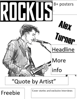
Here are the plans for my front page.I would like my cover model to be centered in the middle with name of an artist and their quote besides the model.The masthead positioned on the right top of the page being the biggest text on the page.The barcode and price in small text places on top of the page next to the logo.There will small images with text explaining the content briefly surrounding the main image. Im also planning to include a freebie of free posters .Both plans follow the conventions of a magazine cover however i decide to base my magazine on the flat-plan on the left as i prefer the c-layout of the magazine.


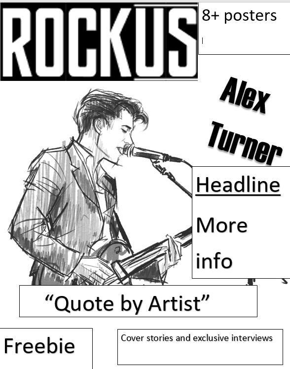
Here are the plans for my front page.I would like my cover model to be centered in the middle with name of an artist and their quote besides the model.The masthead positioned on the right top of the page being the biggest text on the page.The barcode and price in small text places on top of the page next to the logo.There will small images with text explaining the content briefly surrounding the main image. Im also planning to include a freebie of free posters .Both plans follow the conventions of a magazine cover however i decide to base my magazine on the flat-plan on the left as i prefer the c-layout of the magazine.


Those are the flat plans for my contents page.The one on the left was inspired by classic rock magazine content pages.On the left side there page numbers along with content of each page .The masthead logo is on the top right.The main image is the biggest.The content is split into categories to make to it organised and help the reader to find what they wants.On the other side we have a flat plan inspired by kerrang! its laid out differently to the other flat plan as everything is laid horizontally on the page there is also images.The one on the right focuses more on having images.Both follow the guides to a successful content page as they are well organised and follow conventions.I decided to follow the flat plan on the right as i think i having a lot of images to each is more interesting than lots of text and the i really the lay out.
No comments:
Post a Comment