
Those are the results that i have collected from a group of 20 people ,represented in the form of a pie chart.Each chart will show you the results to each of my questions.
This chart shows the age groups whose responses were collected.Majority of the people were 13-18 and the second biggest group was 15-21.My target group focuses on young adults therefore, those results will be useful in seeing what my target group wants there to be in my planned project of a magazine thus, helping me to make successful.
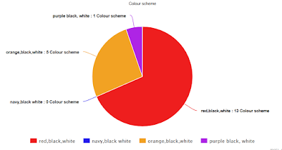
In this questions i asked the participants to tick the box with the colour they prefer.More than half of them said: red,black,white , this is no surprise as we associate those colours with the rock genre.The second most popular was : navy,black blue this slightly unconventional to the genre but can be fitted to the rock as it still is a quite dark colour.I will therefore definitely include the classic colours but also include other dark colour like navy blue.
The chart below shows us what the people asked said about the content that they would most likely want to see in my rock magazine.Eight of them said interviews therefore seeing the popularity of this type of content i will make the main article an interview with a rock a rock artist.Five said news should be in the in the product so, in my magazine i will ensure there is information of new artists and progress of current artists included. Others said reviews and feature artists as well as advice but that was the popular.I will also include those to appeal to everyone.
This chart just show the percentage of the males and females of the group i asked.90% were females therefore i need to keep that in mind that those questions were mostly answered by female so i will be appealing to that group.
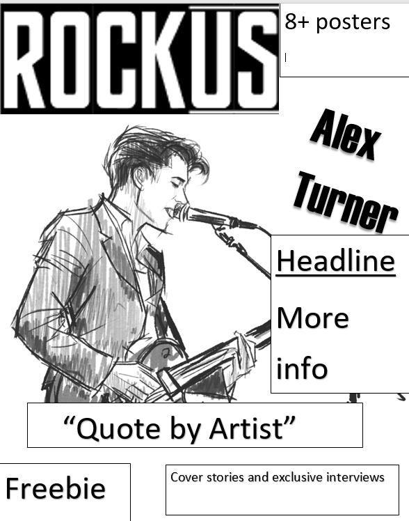
I gave the participants a number of mastheads to choose from .Most chose the first masthead , this masthead was simple and bold unlike the others that looked more artistic.The second one had this effect of liquid pouring onto it resembling blood 6 people people chose this masthead perhaps because they agreed that it would fit the rock genre as it is gory.The thirst masthead was the least popular,it has an urban style.I will use the first masthead as it was popular for its simplicity.
This question concerned itself about how often would the magazine be published .9/20 said weekly therefore i will make the magazine to be published weekly.
I also asked the people to state their preference on types of rock music.The results were quite evenly spread out except classic which only got 2/10 perhaps because classic rock is outdated and old nto appealing to the target audience.The others scores 6/20 each therefore i will include different types of artists that perform either electronic,pop or indie music.

Finally for the last question i asked if they would want a free gift in their magazine.All said yes therfore i will include a freebie in the magazine.
These are the results I achieved through the questionnaire. I found out that pop rock was popular in my research. i will try to focus to make my magazine look like a pop rock magazine by looking at other Delete repeated word.I also found out that the age group is young teenagers, this means the prices of the magazine would have to be low to be affordable to my target audience. Moreover, I got an grasp of what my audience wants my content of the magazine to cover.Most people preferred interviews but the rest of choices were pretty evenly distributed.Therefore I will try to cover all content mentioned but focus on interviews to specifically target my audience. I discovered that people felt that the most suitable colour scheme for my rock magazine was red, black and white.Therefor I will try to adapt it to my houstyle. The people I questionnaired said they wanted the first font to be the masthead so, I will use this font as the masthead of my rock magazine. Through this questionnaire i found what my audience would want the magazine to look like and its content as well the prices of the magazines


 Those are the results that i have collected from a group of 20 people ,represented in the form of a pie chart.Each chart will show you the results to each of my questions.
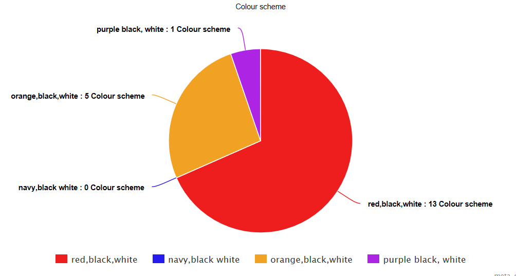


 Finally for the last question i asked if they would want a free gift in their magazine.All said yes therfore i will include a freebie in the magazine.

 Firstly i went for a more darker colour scheme for the cover but than thought that the cover would look more attractive with more neutral colours whilst still commiting to the black , red and white colour scheme.My masthead has a sort of metallic look but than i changed it to look more simple .The main image also changed , its the same model and prop however the way the anqor is position changed .When getting feedback from my teachers and peer they said some fonts and the barcode was unclear therefore i made the barcode bigger and made folder with added drop shadows.I also changed the positioning of the buttons .


 In this example the three main colours work together with the main image.For instance the guitar has is silver and black so,the colour of the titles is also black and gold.


